When I started design school, I didn’t really think I’d ever be good at what I do. I wasn’t enough of what I thought a designer should be. I didn’t wear the right clothes, style my hair the right way, and I didn’t feel like I had any design sense whatsoever. I didn’t think it could be learned, but I figured what the heck? I’ll give it a shot and see what comes of it. In this post, I am going to offer a critique of some of my early work, and rework it.
WHAT IS REGAIA?
Regaia was the brainchild of my ex-boyfriend that never came to fruition. In fact, I’m almost positive someone else beat him to the punch. The Regaia concept was to engineer sustainable energy solutions for individual homes that would prevent anything and everything from going to waste, creating a home that was net-zero in energy use and household waste.
THE ORIGINAL DESIGN
The original design came from an assignment called Alter Ego. The objective was to create an identity package, including a letterhead, an envelope, and a business card. I chose to use Regaia for my project.
THE CRITIQUE
This is bad, and here’s why. For starters, I think the color scheme is weak. I like the start of using a blue and a green, and I understand going for earthy tones by using brown. In my opinion, there is too much brown, and the green and blue are too bright.
Next, on the business card, the text at the top is extremely poorly spaced between the a-g-a. I also don’t think the leaves at the top of the g are appropriate. At smaller sizes, they won’t show up, and visually it’s overkill with the leaves to the side.
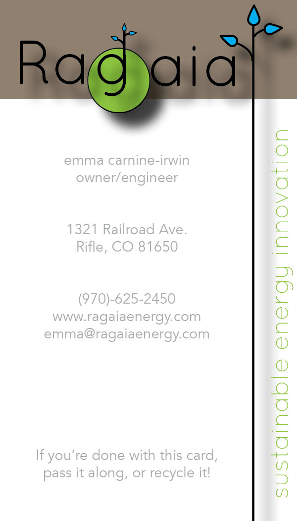
On the business card, the body copy text (contact info) is well-spaced and I like that the text has room to breathe. That being said, I see some hierarchy problems. With the text at the bottom. While it is separated enough from the rest of the copy, it is the same size. It needs an extra layer of visual separation, and truthfully, it doesn’t even need to be there, to begin with.
Elements on both pieces struggle. The black outline looks cheap to me. I never use a black outline. If I have to use an outline of any kind, I use a darker shade of whatever color I’m using. In this case, it’s not needed. Next, the drop shadows are horrible and unnecessary. They make it look cheap, and there’s nothing that needs to stand out more. If there was, there would be better ways to execute that. The drop shadows need to go. The last thing that I take issue with is that green circle behind the G. It messes with the spacing and it adds to the visual clutter that is happening.
To sum up this critique, it’s busy and poorly organized. Kind of like my dining room table.

THE REWORK
This is what you came here for, right? So I tossed most of this design out. I just didn’t feel like it was good enough to fix. Sometimes, that’s what you have to do.
The Logo
I kept the blue and the green but made them a little softer, and not so retina-burny. A few variations of the logo here, one with the tagline, one without, and the water element. I flipped the water element (which was the leaf element) to function more as a unit and establish a less chaotic feeling with the organic shape of the wider part. It both functions as a cloud and water droplets, which works because that’s basically what clouds are: water vapor, and water is a key element of what would make the company’s product work. I definitely ditched the outlines and the drop shadows, as well as the green circle. Having more experience choosing typefaces than I did my first semester of design school, I chose a different typeface for it’s clean, gentle, and modern aesthetic. Instead of having leaves coming out of the G, I moved the graphic element to the tittle on the i. (Fun fact: the dot on top of the i is called a tittle.) Lastly, I changed the spelling because I thought the spelling looked stupid. Normally, I would never do that on a rebrand, but this company isn’t real and it’s my project so I can do what I want.


The Business Card
Naturally, a logo change is a new aesthetic, so of course, the entire design of the business card was updated. It’s much cleaner than the original. Using both sides of the card allowed me to eliminate the clutter, and make the elements hold their own a little more. My only critique here is that the back seems a little crowded with the water element and the text, but overall this is a major improvement.

The Letterhead
Believe it or not, I kept some of the aesthetic concept. I liked the idea of the watermark, so I kept that and used the water element as the watermark and repeating the element in the logo. I kept the letterhead fairly straightforward, as letterhead isn’t anything that needs to be complex or fancy. Fun fact, the text in this is Cupcake Ipsum which is by far my favorite dummy text generator.
REFLECTION
While the rework isn’t perfect, it is a drastic improvement, and it is something that I would be confident submitting to a client for review. I created a cleaner aesthetic with fewer crimes against design. One interesting thing that I’ve found is that since I started design school, concept development has gotten a lot harder, but coming up with stuff on the fly, as I did here, is much easier. I discovered that I’ve gained a significant amount of skill in design thinking as well as executing concepts. I learned that when you get better at something, that thing sometimes gets harder in some ways, like concept development, but easier in others, such as quickly creating something on the fly. The things that start off easy sometimes become the hardest part of the job, and vice versa.
ADVICE TO YOUNGER ME (AND NEW DESIGN STUDENTS)
It’s okay to suck now. You’re in school to get better. School is your time to suck, be bad at design and learn. Feel free to suck.